As an eCommerce shop, your ability to convert browsers into email subscribers is crucial for your success.
Since most of your site visitors will leave and never return, you need a mechanism for converting a portion of the traffic coming to your website into subscribers who you can remarket to.
In today’s age this is pretty much table stakes for any ecommerce business, but many of the brands I’ve analyzed either haven’t optimized their popup enough or have over optimized it. Today I want to show you how to increase your email opt-in rate by focusing on three needle-moving tests that will drive the bulk of your results.
Here’s what we’ll cover:
- How to calculate your email opt-in rate
- What’s a good email opt-in rate
- The 80/20 of email opt-in testing
- Test your opt-in offer
- Test your opt-in layout
- Test your opt-in timing
Let’s jump into it.
How to calculate your email opt-in rate
There are two common ways I’ve seen email opt-in rate calculated –
First, using impressions:
Email signup rate = email sign ups / opt-in impressions
Second, using new users:
Email signup rate = email sign ups / website new users
While both have their place, I prefer to use the second method to calculate my email opt-in rate (using new users). At the end of the day, what I truly want to know is how many new visitors are converting into email subscribers regardless of how many impressions they may be triggering.
Regardless of which methodology you choose, make sure you stick with it so you’re tracking consistently.
What’s a good email opt-in rate?
The answer, as any marketer worth their salt will tell you, is it depends.
Here are a few things it depends on:
- Your industry – different industries & verticals can have different buying behaviors. An apparel brand, for example, will likely see a higher opt-in rate than a tech & computing brand. It’s important to set proper targets & expectations based on industry benchmarks.
- Quality of your traffic – if you’re bringing in high quality with high purchase intent, you’re going to see a better signup rate than if you’re bringing in low quality traffic that bounces within seconds of landing on your site.
- Quality of your offer – if your offer is compelling and relevant to your target audience, you’re going to have a better signup rate. If it requires little commitment, you’ll have better signup rate. We’ll talk more about these in a moment.
- How you’re collecting emails – if you’re using a full-screen popup, you’ll see a much higher opt-in rate than if you use a small corner slider tab that’s easy to miss. There are pros and cons to each but it’s important to understand how they work.
With all that, your email opt-in rate will generally fall somewhere between 1 – 5%, sometimes higher (hopefully not lower).
Again, this depends on how you’re calculating it. If you’re using impressions as a denominator, your email opt-in rate will be lower than if you use new users. It’s difficult to get proper data on how benchmarks are being calculated (JustUno has some good data here), but from my experience you should be targeting an email opt-in rate of 5%+ using new visitors as your denominator.
Let’s talk about how to increase your email opt-in rate with testing.
The 80/20 of Email Opt-In Testing
When it comes to optimizing for email signups, there’s an endless list of things you can test – colors, images, layouts, form fields, offers, timing, etc. The challenge is identifying which ones are worth pursuing and which ones aren’t.
One downside of A/B testing is you can easily get sucked into spending a lot of time and effort optimizing for tiny improvements instead of focusing on high-impact improvements. I remember one quarter we ran 20+ different A/B tests and our email opt-in rate went from 5.19% to 5.49%. Was it worth it? It depends.
If you’ve got a really high volume of quality traffic coming to your site, then this level of optimization may make sense. But for most ecommerce shops, you’re better off focusing on the 80/20 rule:
80/20 rule of email opt-in testing: find the small handful of high impact tests (20% of effort) that will drive the bulk (probably well over 80%) of your results.
Here are the the three key things (the 20%) you should be testing:
- Test your opt-in offer
- Test your opt-in timing
- Test your opt-in layout
And do it in that order. Let’s dive into each test.
Test Your Opt-in Offer
The very first thing you wan to test is your opt-in offer. This is your greatest lever for increasing your email opt-in rate.
Remember, the goal is to convert someone from a site browser into an email subscriber. In order to do that, you need to offer something worth signing up for. The classic ‘join our newsletter’ just doesn’t cut it anymore.
Here are a few important things to think about when it comes to your offer:
- Purchase intent – different offers signal different purchase intent. Someone signing up for a ‘get 10% off your first order’ offer signals much higher purchase intent than someone signing up for a ‘win a free [product]’ giveaway offer. This is really important to understand. Typically, a higher purchase intent offer gets you higher quality leads (but fewer of them)
- Commitment – how much time and energy does the subscriber need to commit to consume what they’re signing up for? A get 10% off your first order’ is low commitment .. it’s just getting a discount code after signing up. Alternatively, a ‘register for our webinar’ requires a higher level of commitment. Ultimately, both are worth testing.
- Relevance – how relevant is your offer to your products and services? If you’re selling comfy slippers but you’re running a ‘sign up to win a free iPad’ offer you might get a lot of interest (who doesn’t want an iPad), but the quality of those leads will be strikingly poor.
As you can see, there are tradeoffs you’ll need to consider as you’re creating your offer. Some offers will convert really well but bring in low quality (low purchase intent) leads while other offers won’t convert as well but will bring in high quality (high purchase intent) leads.
In my opinion, the best offers are high purchase intent, low commitment, and high relevance offers. Yes you’ll get fewer leads but they’ll be the ones most likely to buy and they’ll keep your email backend clean and healthy. However, it doesn’t mean you shouldn’t experiment with some other creative offers as well. Mix it up and see what works for your audience.
Let’s look at a few different offers you can test.
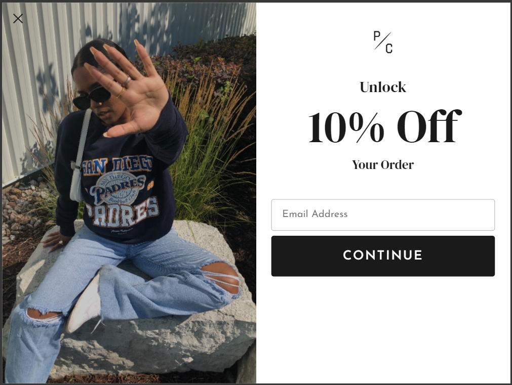
Discount Offer
The discount offer is the most common offer you’ll see eCommerce shops running these days and it’s typically the most effective. You’re offering your shoppers a discount ($ or % off) on their (first) order in exchange for their email address.
Offer = save x% on your order or save x$ on your order
Purchase intent = high
Commitment = low
Relevance = high
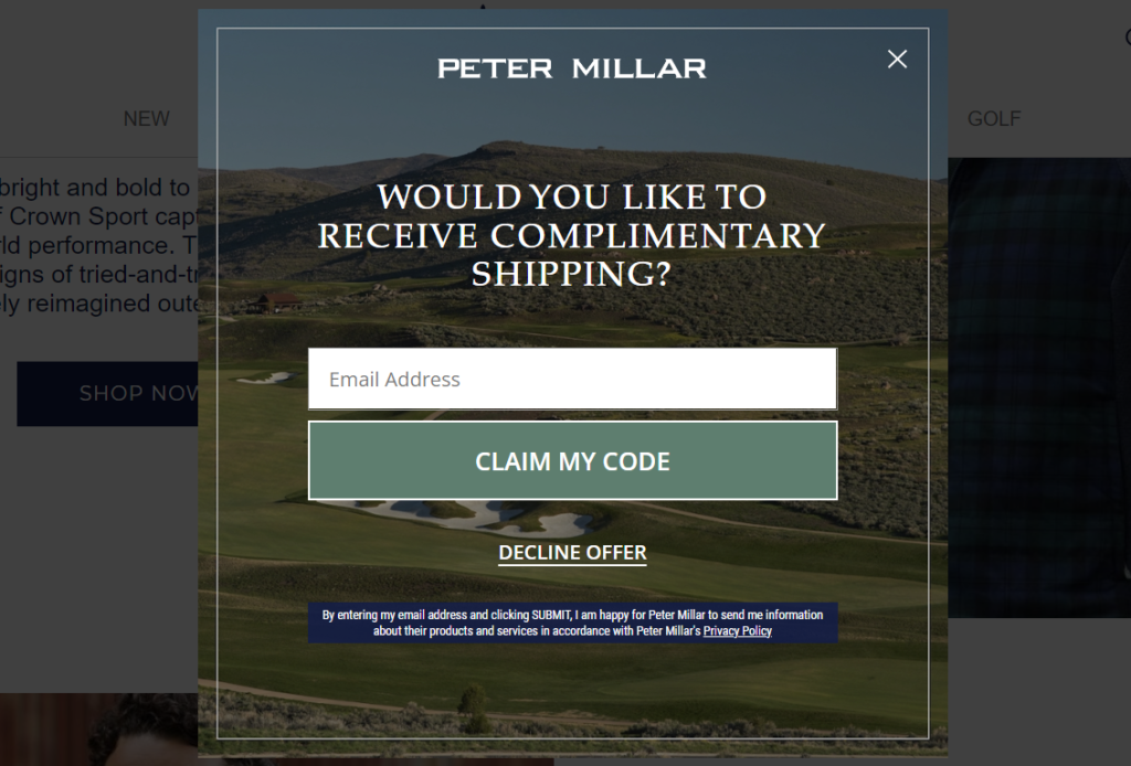
Free Shipping Offer
For brands that prefer not to discount, the free shipping offer is a good one to test. You’re offering your shoppers complimentary shipping in exchange for their email address.
Offer: get complimentary shipping with your purchase
Purchase intent = high
Commitment = low
Relevance = high
Giveaway Offer
The giveaway offer is a fun and high converting offer to test with for your audience. You offer your shoppers a chance to win one of your popular products or bundles in exchange for their email address.
Offer = sign up today to win a free X
Purchase intent = medium
Commitment = low
Relevance = medium
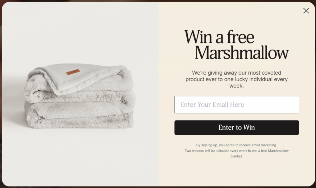
A few things to consider with giveaway offers:
- You can run this offer in perpetuity and give away a free product weekly or monthly.
- Because purchase intent is lower, you won’t see these subscribers convert into customers as quickly (or as often). You’ll want to structure your giveaway email flow a little differently than your standard welcome flow. Message me if you need help (I’ve got some good templates).
- The product you’re giving away should be relevant to the products and services you offer. So if you’re selling slippers, give away a free pair of slippers every month and use that to incentivize browsers to opt-in.
Pro tip: one tactic to test is to run a giveaway offer as an exit intent offer. Typically, people who are about to leave the site don't have intent to purchase, so putting a low intent, low commitment offer to win something free is ideal.
Free Gift Offer
The free gift offer is not one you’ll see very often, but if you’ve got the right product it could work really well. You’re offering your shoppers a free gift (something physical they receive in the mail) in exchange for their email address.
Offer = claim your free [product]
Purchase intent = medium
Commitment = medium
Relevance = high
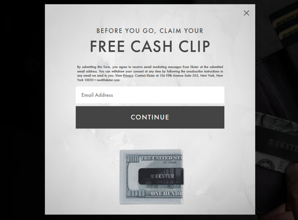
A few things to consider with this offer:
- Free gifts are ideally small, low cost products that have a high perceived value to your target audience.
- You’ll want to set this up as a two-step process: 1) collect email address first, 2) collect shipping information second. Don’t try to collect everything in one step as it will destroy your conversions.
- Relevance is important with these. If you’re selling slippers but offering a fidget spinner as a free gift with your logo on it, there’s too much of a disconnect.
Download Our Free Guide Offer
This is the more traditional type of offer you’d expect from retailers. You’re offering your shoppers a digital download (training resource, brochure, etc.) in exchange for their email address.
Offer = download our free guide
Purchase intent = high
Commitment = high
Relevance = high
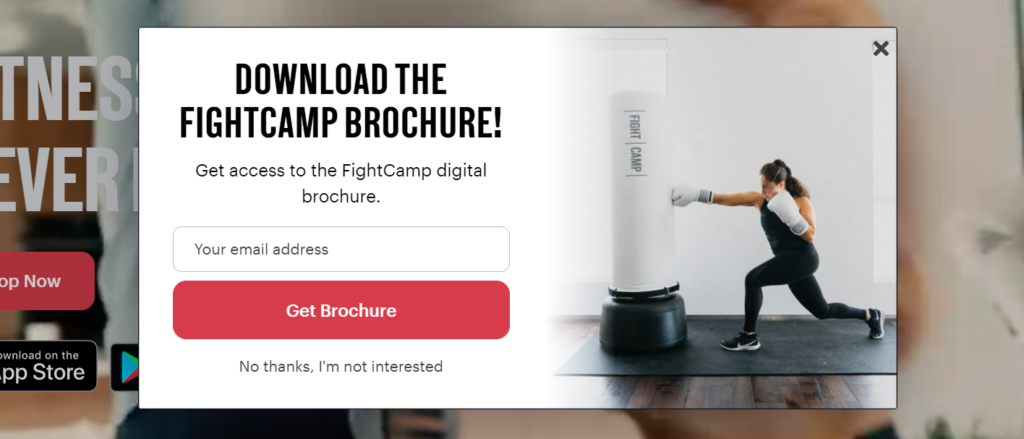
In my experience, these don’t convert as well as they used but they’re still worth testing. Think about what information & value you can give away that prospective shoppers would want to know. Tip: it should tie back to the same problem that your product solves.
Quiz offer
Quizzes have become very popular in the ecommerce space over the past couple of years. The most effective quizzes help customers narrow down their selection from a rather broad catalogue which is why you see them used so frequently in apparel, fashion, footwear, etc. They’ve also become very effective for lead gen which is why I’m including them. You’ll often see quizzes running in tandem with other opt-in offers.
Offer: take our quiz to find your perfect X
Purchase intent = high
Commitment = medium
Relevance = high

Test Your Email Opt-in Layout
OK so you’ve found your winning offer. You know what you want to offer. Now what?
The next thing you want to test is how you present your offer. This is your email opt-in layout.
How you present your offer is really important. Ultimately, it boils down to this: the more real estate your opt-in takes up, the higher the likelihood shoppers will see your offer and convert. But there’s a catch .. the more real estate your opt-in takes up, the more potential it has to be distracting and /or annoying to shoppers. So you have to tread lightly. There are differing opinions here, of course, so you’ll have to make your judgement on what makes the most sense for your brand.
There are a handful of opt-in layouts to choose from – popups, spin-to-wins, full-screen popups, corner slide-in units, banners, etc. They all fall in a different place on the opt-in conversion to annoyance scale so you’ll have to experiment.
JustUno did a great analysis on what types of layouts work the best:
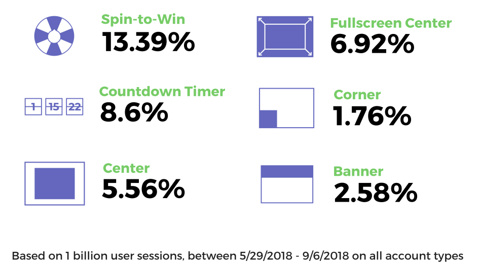
If you’re not sure where to start, choose the highest-converting layout that makes sense for your brand and work your way down. If a spin-to-win doesn’t feel on brand, start with a popup or site banner and go from there.
You also don’t need to choose just one opt-in layout. You can run a popup and a banner at the same time or a full screen unit with a corner unit. The idea is to test out as many of the different layouts as you can until you find the one that converts best for you. You can use a tool like OptinMonster to test all these layouts.
Test Your Email Opt-in Timing
So far you’ve tested what you want to offer and how you want to offer it. The last piece of the puzzle is to test when you want to present your offer. This is your opt-in timing.
There are only a handful of options to choose from when it comes to timing:
- On first load or within X time of load – present your offer as soon as a shopper lands on your site or within a certain time frame of them landing on your site. The shorter the time frame between load time and when you show the opt-in, the higher your impressions will be but the less information shoppers will have collected to know if the offer is right for them.
- After X pages or after X% scroll – present your offer only after a shopper scrolls through your landing page far enough or looks at a certain number of pages on your site. This ensures your offer is only shown to people who are showing interest in what you have to offer so you’ll likely see better conversions but fewer opt-in impressions.
- Exit intent – show your offer when a shopper moves their mouse to the top right of the screen which signals they’re about to leave (the tech works a bit differently on mobile). This ensures that browsers that are about to leave are presented with one final chance to sign up. Since most shoppers have made up their mind here, it takes the right offer to change their mind and get them to convert.
Again, you don’t have to settle for one timing option. You can experiment with different timing triggers for each of the different layout options you’re using. It gives you quite a bit of variety to work with.
Final Word on Opt-In Testing
Your goal as an ecommerce shop is to convert as many website browsers into customers, but very few of them will land on your site for the first time and make a purchase. That’s why capturing email addresses is so important.
Capturing an email address allows you to effectively remarket to a portion of your audience who has signaled interest. By signing up to receive emails from you, they’ve made a micro-commitment. And that’s huge.
The truth is, if you want to increase your email opt-in rate, you don’t need to test every little detail. You want to focus on optimizing three things: your offer, your opt-in layout, and your opt-in timing (in that order). That will get you the best results in the least amount of time.
Hope you found that helpful. If you’re looking for help with setting up your lead gen strategy, feel free to reach out to me or check out my services. Cheers!
✌

